CASE: DEVELOPING A PACKAGING DESIGN CONCEPT FOR THE ENTIRE PRODUCT LINE
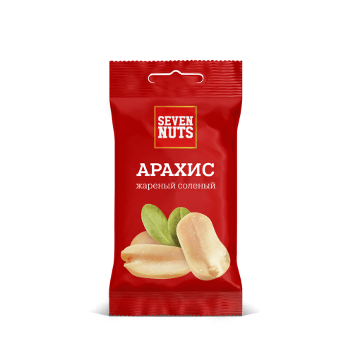
Seven Nuts


TASK
To develop a design for a line of Nuts produced in the federal network "Red and White" retail
COMPETITOR ANALYSIS
Competitive analysis allows you to track market trends and focus on important points for the consumer
1
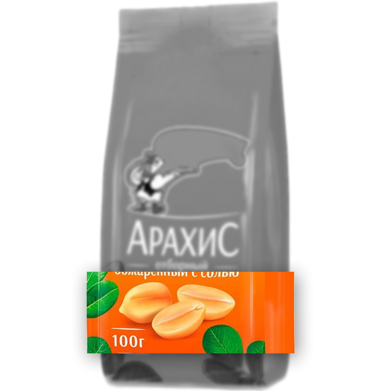
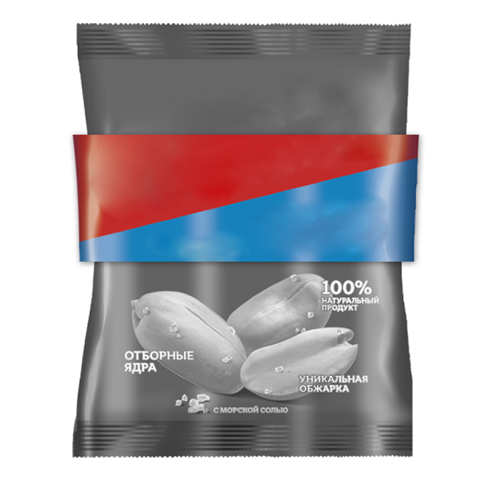
Emphasis on the product. Most representatives make up a transparent window.
2
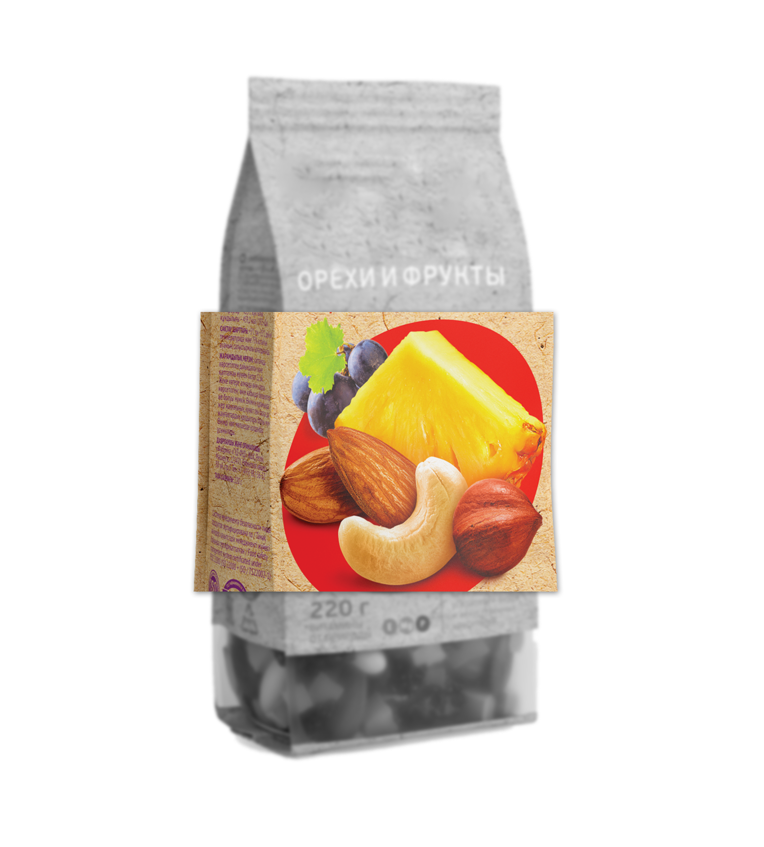
Different color depending on Nuts or flavors.
3
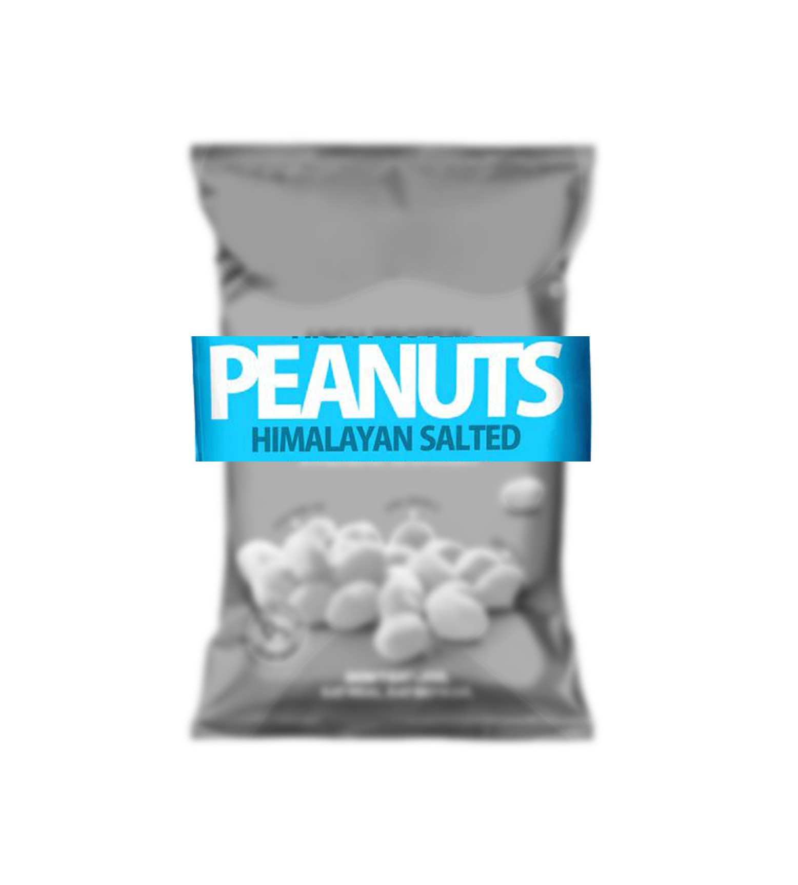
In addition to the logo from the inscriptions, it is necessary to print large: "The name of the nut" and its taste.
SOLUTION
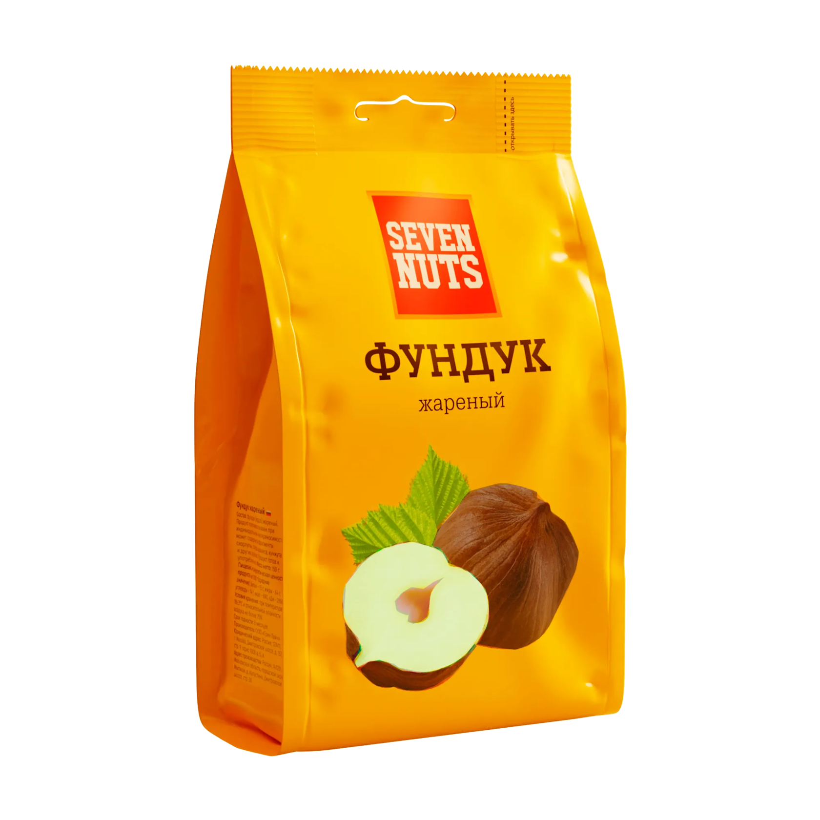
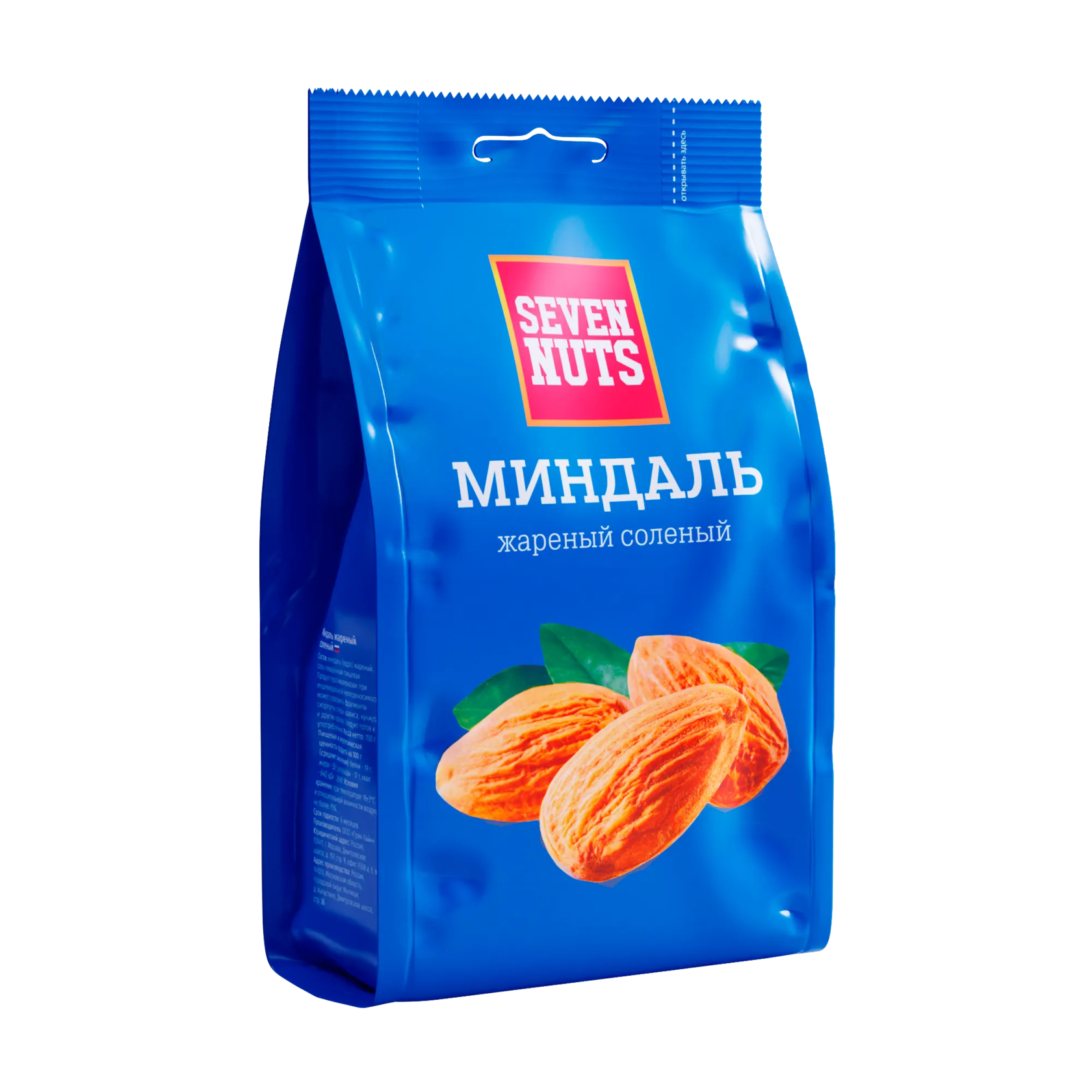
Separation by colors for different tastes
Large product on the face
Readable typography
Interesting facts about nuts on the reverse side
Packing M-bag
150 g
150 g
Key packaging line
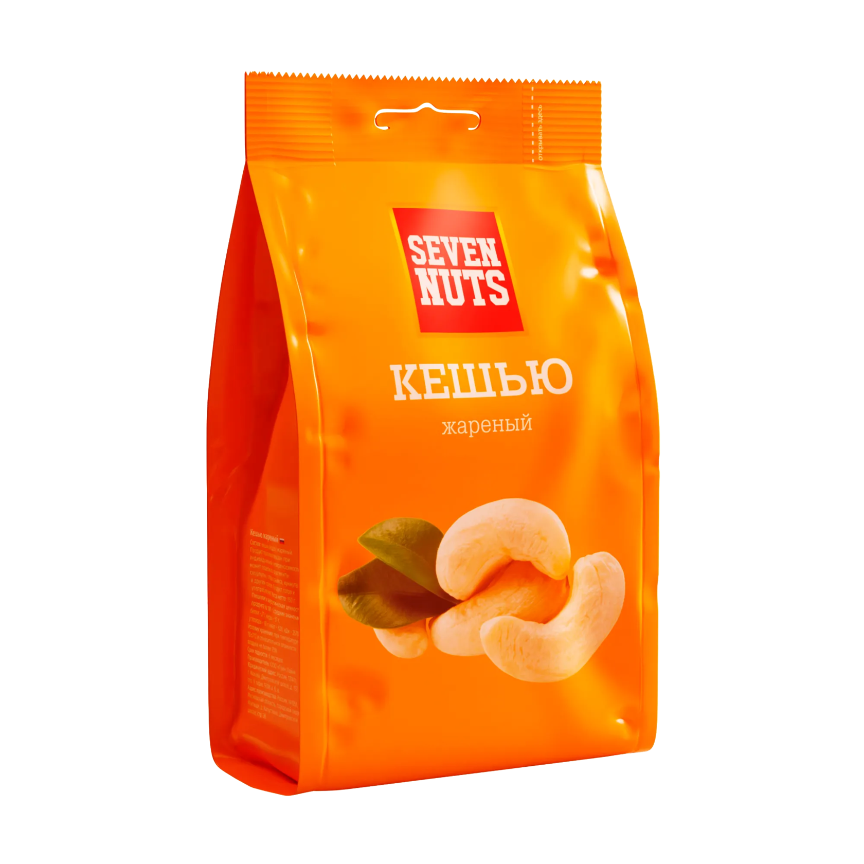
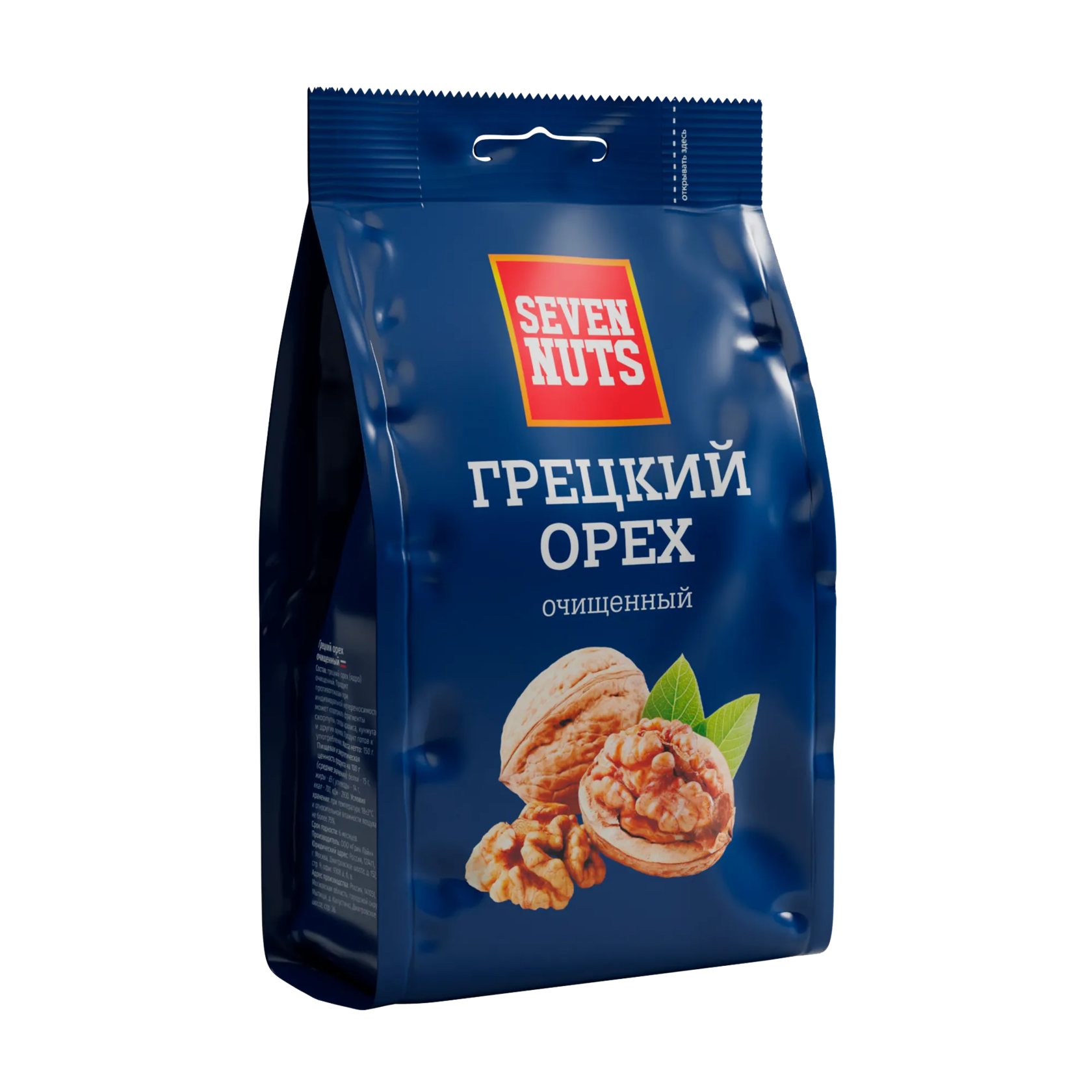
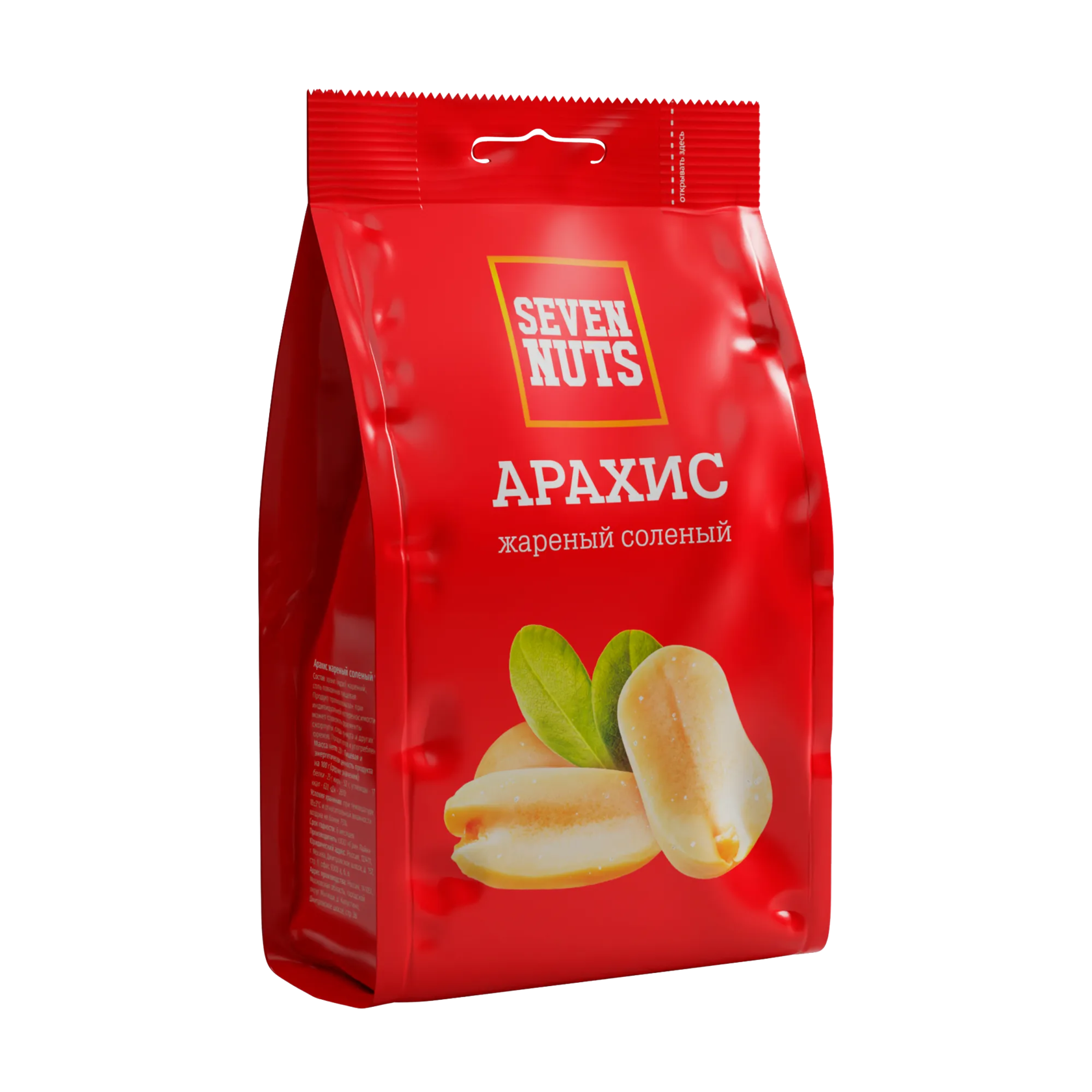
РЕЗУЛЬТАТ
SEVEN NUTS
Flow-pack packaging
50 g
50 g
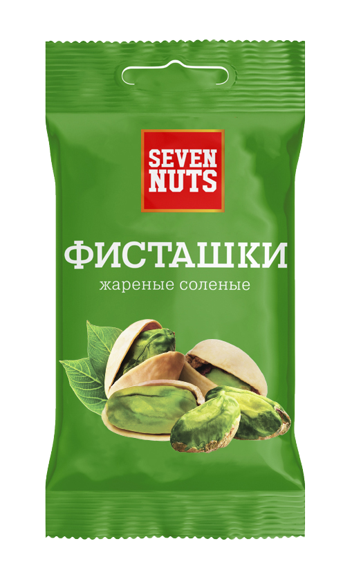
A line of packages based on the main one. Reduced packaging.
RESULT

SEVEN NUTS
Interesting fact about project
Seven Nuts products appeared in more than 10,500 stores
Reflects association with coloring of nuts
The most important thing in facing: product window or product visualization. The product should be at least 40%.
Color
Product on facing
Logotype
For memorability and brand recognition, it is also necessary print on the face
Walnut name and signature
The name of the nut and its taste
be sure to take out packaging for facing
be sure to take out packaging for facing
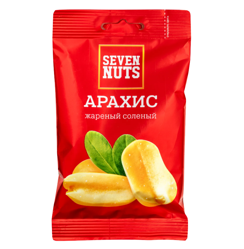
Design analysis


Open label
As a special usability element of any product
Job offer
Make an offer
By clicking the "Submit" button, you agree to the personal data processing policy.
Ready for challenging tasks
I am considering various options and forms of cooperation
+995 595 09 11 98 / +7 977 287 94 57 / tsanavagn@gmail.com
© All information provided on the site is relevant.
Tsanava George - UX/UI designer.
tsanava.com
© All information provided on the site is relevant.
Tsanava George - UX/UI designer.
tsanava.com