CASE: UX/UI design of an online clothing store
WEAR-S
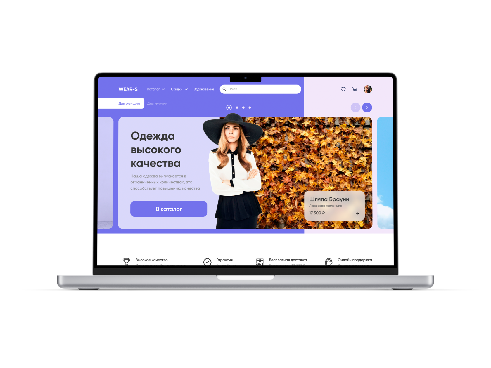

TASK
Create a user-friendly adaptive interface for an online store of women's and men's clothing.
STAGES OF WORK
Before starting work, I take into account all the comments and requirements of the customer, and also work with objections and understanding the market.
1
Assessment and analysis of requirements
Before starting work, I will definitely find out the capabilities of programmers and stack on which the project works or will work.
2
Getting to know the team and the stack
Market assessment and competitor assessment. A detailed analysis with a presentation of the strengths and weaknesses, as well as features of the strongest competitors.
3
Market analysis, participants and target audience
If this is a finished project, then I will definitely conduct research: in-depth interviews and processing statistical information.
4
UX (User Experience) Analysis
Before starting development and design, it is necessary to describe and display the main flow (paths) of the user in flowcharts.
5
Compiling a User Flow (User Path)
In fact, this is the creation of a site skeleton based on the User Flow built earlier. Sketches are quickly created, they are easy to edit and initially test.
6
Creating a Wireframe (Project Wireframe)
Applying design and improving the user interface, working out small details, such as shadows or gradients.
7
UI design
and prototyping
and prototyping
Testing can be carried out both at stage 4 and at stage 8 - on the finished design. Depends on the goals and objectives of the project.
8
Interface
testing
testing
After testing, i need to analyse the data and process it to select the most successful design or proofreading and validate the testing.
9
Analytics and data
statistics
statistics
COMPETITOR ANALYSIS
Competitor analysis allows you to track typical market trends
and focus the user's attention on important details
and focus the user's attention on important details
1
Blocks with menu-tabs are used in catalogs to display all categories of the catalog.
2
Competitors are displayed instead of a slider header to display shares and profitable materials.


3
Competitors are identified with unique advantages in the form of infographics.

SOLUTION
Add slider to header
Divide the online store into men's and women's
Add tabs to directory as submenu
Add a block with benefits in the form of infographics
COLOR SPECTRUM
#7371E8
#3A3A3A
#5b5b5b
#ffffff
ATOMIC APPROACH
#ff5400

The atomic approach makes it easy to make changes to the entire design. A design built from components can quickly change.
Components and UI KIT
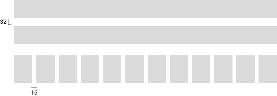
GRID
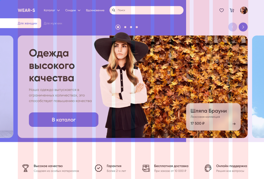
The grid creates a basic structure, a skeleton of "invisible" lines, on which design elements lie. This binds them in a common system and provides a contact composition.
Grid
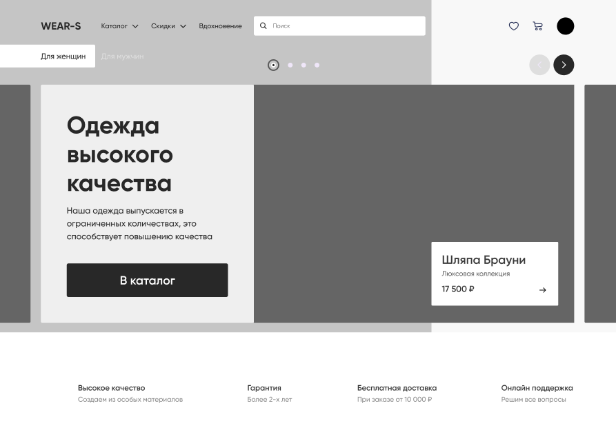
WIREFRAMES
The wireframe is necessary to focus the customer and the performer on how exactly the screens interact with each other, and not on how they look.
Wireframe
FINAL DESIGN

#ff5400
Desktop design
The computer version corresponds to the set goals and objectives, and also simplifies the purchase of clothes through simple navigation and accents in the design.
FINAL DESIGN


The slider in the header draws users' attention to promotions and discounts.
Slider in header
BLOCK WITH COLLECTIONS
#ff5400

FINAL DESIGN
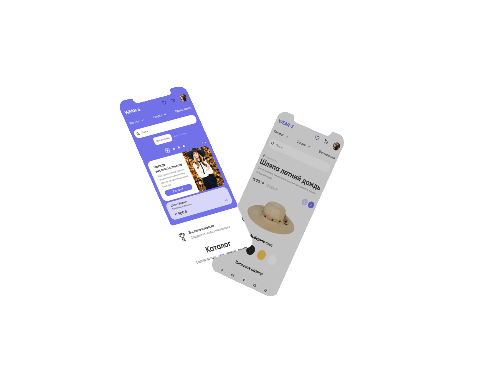
The mobile version corresponds to the set goals and objectives, and also contributes to an increase in orders and simple communication between the user and the site.
Adaptive design
Job offer
Make an offer
By clicking the "Submit" button, you agree to the personal data processing policy.
Ready for challenging tasks
I am considering various options and forms of cooperation
+995 595 09 11 98 / +7 977 287 94 57 / tsanavagn@gmail.com
© All information provided on the site is relevant.
Tsanava George - UX/UI designer.
tsanava.com
© All information provided on the site is relevant.
Tsanava George - UX/UI designer.
tsanava.com
