CASE: UX/UI design of medical healt care information systems for doctors
OkDok

TASK DESCRIPTION
Develop a medical information system for doctors who see patients only remotely using video.
STAGES OF WORK
Before starting work, I take into account all the comments and requirements of the customer, and also work with objections and understanding the market.
1
Assessment and analysis of requirements
Before starting work, I will definitely find out the capabilities of programmers and stack on which the project works or will work.
2
Getting to know the team and the stack
Market assessment and competitor assessment. A detailed analysis with a presentation of the strengths and weaknesses, as well as features of the strongest competitors.
3
Market analysis, participants and target audience
If this is a finished project, then I will definitely conduct research: in-depth interviews and processing statistical information.
4
UX (User Experience) Analysis
Before starting development and design, it is necessary to describe and display the main flow (paths) of the user in flowcharts.
5
Compiling a User Flow (User Path)
In fact, this is the creation of a site skeleton based on the User Flow built earlier. Sketches are quickly created, they are easy to edit and initially test.
6
Creating a Wireframe (Project Wireframe)
Applying design and improving the user interface, working out small details, such as shadows or gradients.
7
UI design
and prototyping
and prototyping
Testing can be carried out both at stage 4 and at stage 8 - on the finished design. Depends on the goals and objectives of the project.
8
Interface
testing
testing
After testing, i need to analyse the data and process it to select the most successful design or proofreading and validate the testing.
9
Analytics and data
statistics
statistics
COMPETITOR ANALYSIS
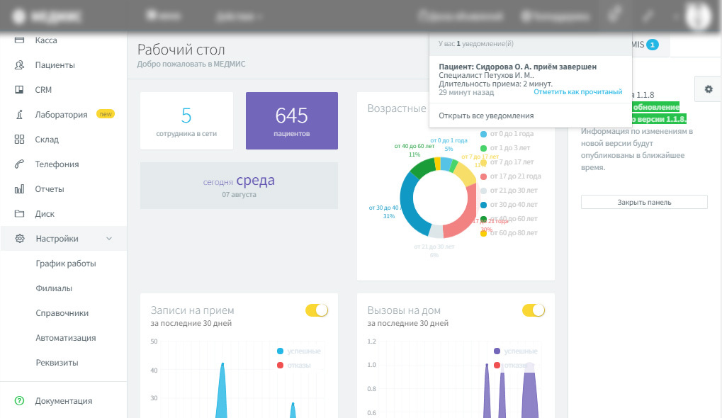
Analysis of competitors allows you to track the characteristic trends of the market and focus users on the details
1
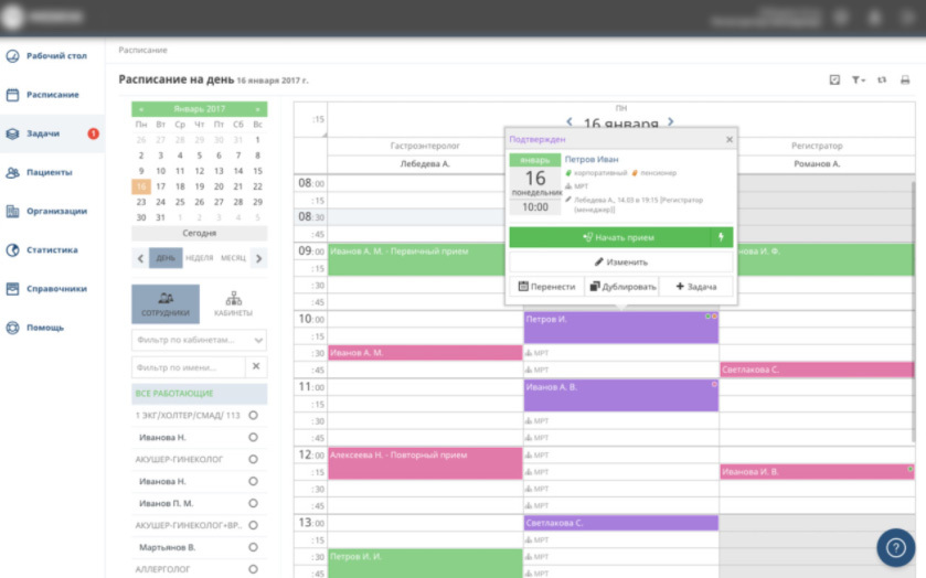
Competitors use different types of charts for convenient display of patients and doctors' working hours.
2
Competitors use a calendar with tabs: daily / weekly / monthly for planning working hours.
3
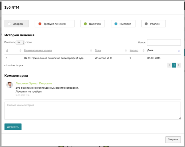
Competitors use special colour and text designations for display patient status
TARGET AUDIENCE AND ROLES
Doctors are reliable users of medical healthcare information system who conduct all consultations online
Doctor
Studying the target audience is necessary in order for the service to meet all the needs and requests of users. You should also study the user experience in depth.
Target Audience
SOLUTION
Add summary analytics for patients
Implement a convenient calendar for scheduling work
Implement search with medical hints
Implement a separate section with doctors' patients
COLOR SPECTRUM
#4E6BFF
#F2F2F2
#F0F4FF
#ffffff
FONTS
For heading

For text
For signatures


GRID
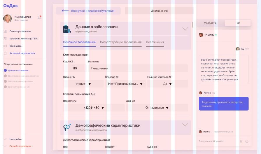
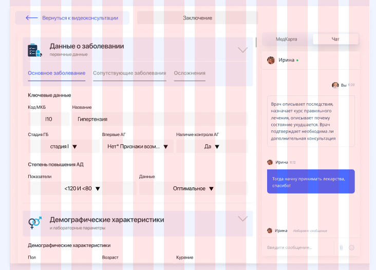
The grid helps to create a basic structure, a skeleton of "invisible" lines, on which design elements lie. This links them into a common system and rationally supports the composition.
Grid
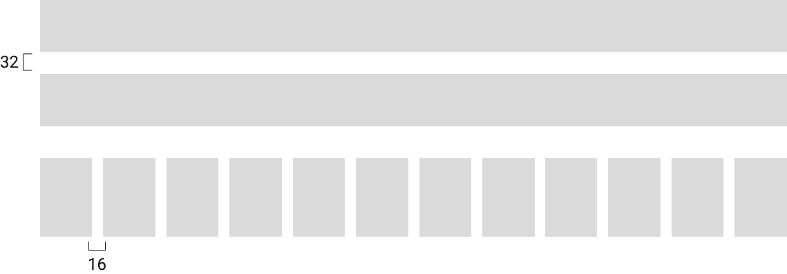
WIREFRAMES
The framework is necessary for the implementation by the customer and the performer on exactly how the screens interact with each other, and not on how they look.
Wireframe
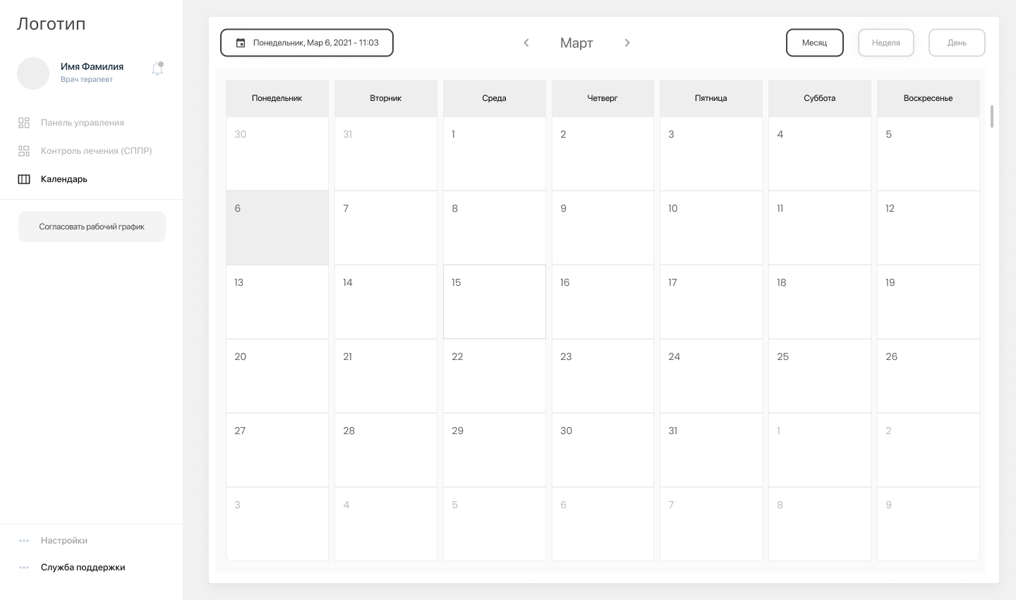
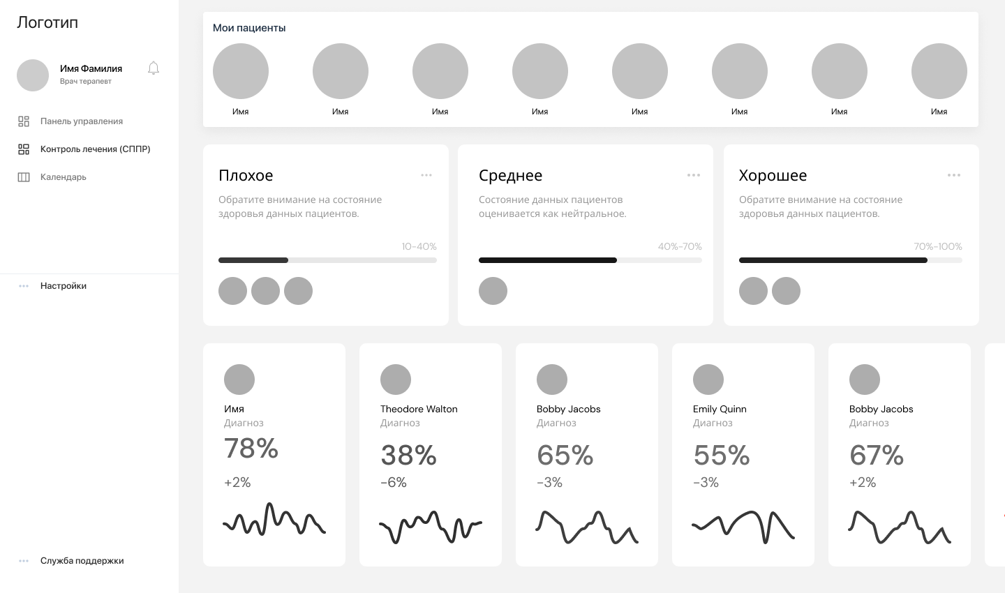
ATOMIC APPROACH
#ff5400
The atomic approach makes it easy to make changes to the entire design. A design built from components can quickly change.
Components and UI KIT
FEATURES
#ff5400
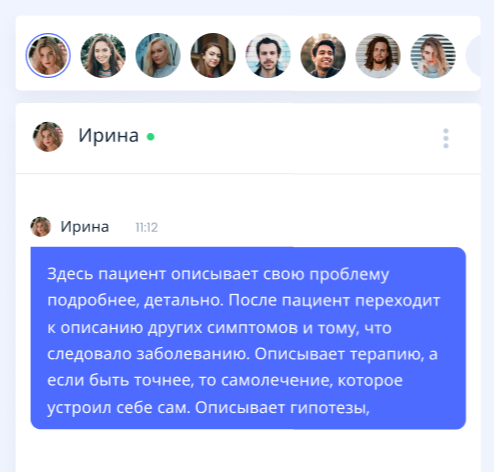
List of patients in chat
List of recommended patients above the chats for a quick transition into.
#ff5400

Patient status indicator
The status indicator is based on receiving research and processing it through AI. Thus, doctors understand which patients should be paid attention to.

#ff5400
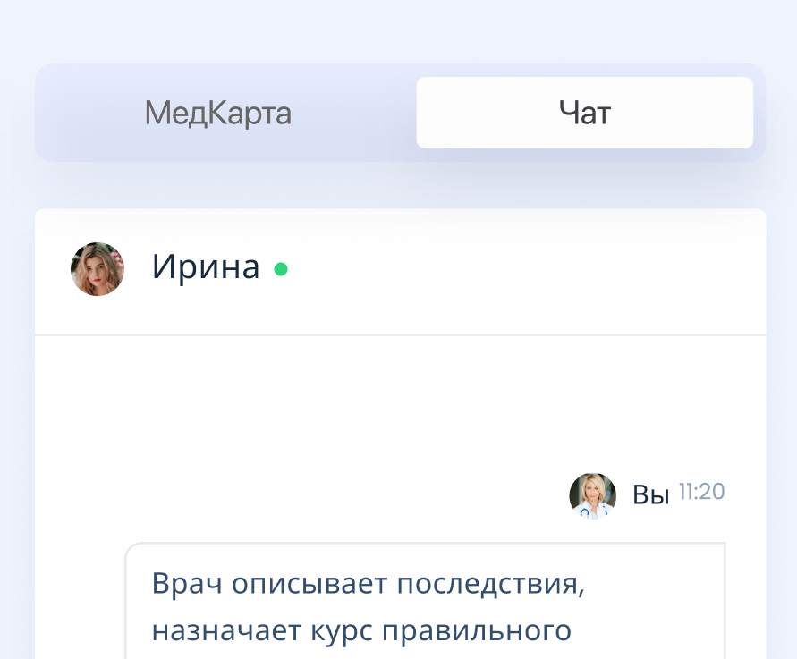
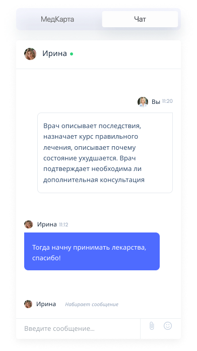
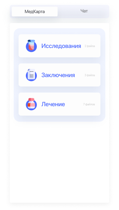
Switching in chat (when online call active)
Switching in the chat during a call will help the doctor not only write in the chat during an online call, but also switch to the patient's medical record and quickly find out the necessary information from the anamnesis.
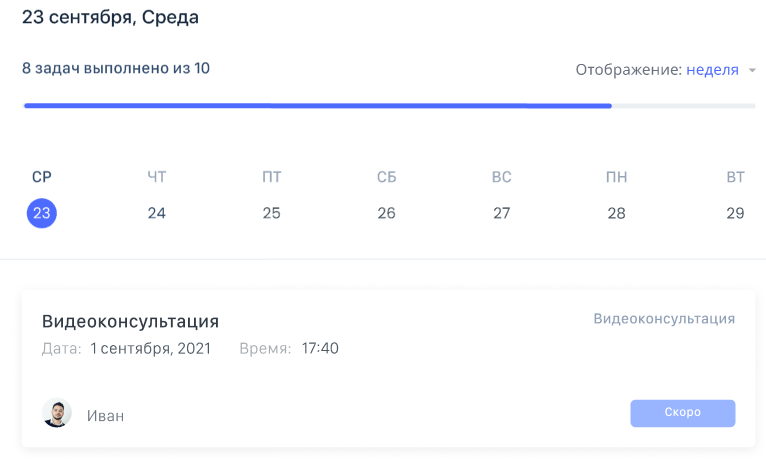
Display of completed and upcoming tasks to understand the doctor about the work done and future work.
Task Display
#ff5400
#ff5400

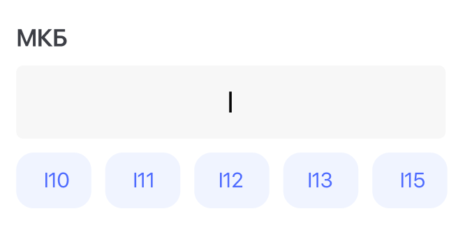
Tips for doctors
Tips for doctors when searching for diseases by name or by ICD code with auto-completion and loading of disease data.
FINAL DESIGN

Unlike the mobile version for patients for doctors, at this stage only the desktop version is provided for work. There are plans to create a mobile chat for doctors.
Desktop design
Job offer
Make an offer
By clicking the "Submit" button, you agree to the personal data processing policy.
Ready for challenging tasks
I am considering various options and forms of cooperation
+995 595 09 11 98 / +7 977 287 94 57 / tsanavagn@gmail.com
© All information provided on the site is relevant.
Tsanava George - UX/UI designer.
tsanava.com
© All information provided on the site is relevant.
Tsanava George - UX/UI designer.
tsanava.com
